
“Hey, Cathleen, if the expansion of the Universe stretches light’s wavelengths, how do you know when you see a color in a star what you’re looking at?”
“Excuse me, Professor, but your office-mate said you’d be here at the coffee shop and I have a homework question.”
“Good heavens, look at the time! It’s my office hours, I should be over there. Oh well, you’re here, Maria, what’s the question?”
“You showed us this chart and asked us to write an essay on it. I don’t know where to begin.”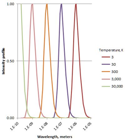
“Ah. Hang on, Vinnie, this bears on your question, too. OK, Maria, what can you tell me about the chart?”
“Well, there are five peaked curves, labeled with different temperatures. Can I assume the green curve peaks, too, not continuing straight up?”
“Yes. What else?”
“The horizontal axis, sorry I don’t know the word —”
“abscissa”
“Oh, we have almost the same word in Spanish! Anyhow, the abscisa says it shows wavelengths. It goes from a tenth of a nanometer to maybe 10 micrometers. The chart must have to do with light, because sound waves can’t get that short. The … ordinada…?”
“Ordinate”
“Thank you. The ordinate says ‘Intensity’ so the chart must show light spectra at different temperatures. But there’s only one peak at each temperature.”
“Is that Kirchhoff’s ‘continuous spectrum,’ Cathleen?”
“Right, Vinnie, a smoothly-varying cascade of every wavelength, photons arising from heat-generated motion of charged particles.”
“Ah, ya lo veo — this is blackbody spectra given off by hot objects. You showed us one in class and here we have several.”
“Good, Maria. Now —”
“But all the peaks look exactly the same, Cathleen. The hot objects ought to be brighter. A really hot flame, you can’t even look at it. Something’s phony.”
“Good eye, Vinnie. I divided each curve in the graph by its peak height to put them all on an even footing. That’s why the axis is labeled ‘Intensity profile‘ instead of ‘Intensity.'”
“I’ve got a different issue, Cathleen. Hot objects have more energy to play with. Shouldn’t the hotter peaks spread over a wider wavelength range? These are all the same width.”
“I think I know the answer to that one, Mr Moire. In class la profesora showed us how the blackbody curve’s equation has two factors, like B=W*X. The W factor depends only on wavelength and grows bigger as the wavelength gets smaller. That’s the ‘ultraviolet catastrophe,’ right, ma’am?”
“Mm-hm. Go on, Maria.”
“But the X factor gets small real fast as the wavelength gets small. In fact, it gets small so fast that it overpowers W‘s growth — the W*X product gets small, too. Do you have that movie you showed us on your laptop there, ma’am?”
“Sure. Here it is…”
“OK, the blue line is that W factor. Oh, by the way, the ordinate scale here is logarithmic, so the value at the left end of the blue line is 1027/106 or about 1021 times bigger than it is at the right end even though it looks like a straight line. The green line is that temperature-dependent factor. See how it pulls down the orange lines’ values for cold objects, but practically goes away for very hot objects?”
“Yeah, that shows it real good, right, Sy? That orange peak moves to the left just like Cathleen’s picture shows. It answers your question, too.”
“It does, Vinnie? How so?”
“‘Cause the peaks get broader as they get higher. It’s like the intensity at the, umm, microwave end hardly changes at all and the whole rest of the curve swings up and out from there.”
“Keep in mind, guys, that we’re talking really large numbers here. Vinnie’s ‘hardly changes at all’ is actually a factor of 40,000 or so. Those pretty peaks in my homework chart are only pretty because the spread-out tails are so small relative to the peaks.”
“Alright, Cathleen, but how does Maria’s question tie in with mine?”
“They both hinge on wavelength. The blackbody equation lets us measure a star’s temperature by looking at its color. Do you have enough to start on that essay, Maria?”
“Yes, ma’am. Gracias.”
“De nada. Now run along and get to work on it.”
~~ Rich Olcott
