<chirp chirp> My phone’s ring-tone for an non-business call. “Moire here.”
“Mr Moire, it’s Jeremy.”
“I hope so, Jeremy, my phone shows your caller-ID. I’m glad you called instead of trying to drop by, the city being under lockdown orders and all. What’s your question?”
“Oh, no question, sir, I just called to chat. It’s lonely over here. If you’ve got the time, anything you’d like to talk about would be fine.”
“Mm… Well, I am working on a project but maybe talking it out will help get my thoughts in order. Have you seen that ‘Flatten the curve‘ chart?”
“Sure, it’s been hard to escape. They use it to tell us why we shouldn’t do group stuff while this virus is going around. Are you writing about where the chart comes from?”
“That’s my project, all right. There’re two ways to get to that chart and I’m trying to decide which will work better. I could start from ecology studies of invading organisms taking over a new territory. At first the organisms multiply rapidly, doubling then doubling again —”
“That’s exponential growth, Mr Moire. We talked about that!”
“Just sent you an image. When researchers plot invasions they usually look like the black line, the Logistic Curve. Its height represents the organism’s population as time increases left-to-right. At the beginning there’s that exponential rise. Over on the right the growth rate slows as the plants or animals or bugs use up increasingly scarce resources. The part in the middle’s almost linear. All that’s a familiar story by now, right?”
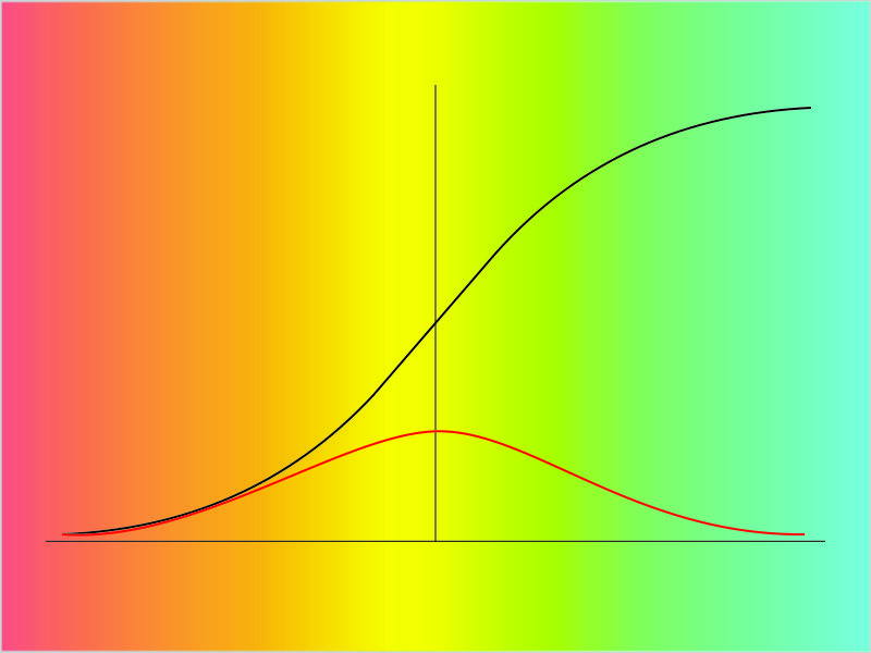
“Uh-huh. We talked a lot about ecology back in kid school except we hadn’t learned graphs yet. What’s the red curve?”
“That’s the interesting part I’m trying to write about. One way to look at it is that it’s simply the slope of the Logistic curve. See how where the Logistic is rising, the slope is rising, too? That’s the way exponentials work — ‘the higher the faster‘ as they say. The slope switches direction just where the Logistic switches from growth to slow-down. The Logistic Curve approaches its limit when the organism’s population approaches the carrying capacity of the territory. That’s also where the slope gets shallowest. Very few resources, very little expansion.”
“What’s the other way to look at it?”
“We start with the slope curve itself. It has its own straight-forward interpretation, especially if the organism is a a bacterium or virus that causes disease. Consider the population under attack as the resource. How fast will the disease spread?”
“Uh… what I keep hearing is that if more people get sick, other people will get infected faster.”
“But what happens when nearly everyone’s caught it and they’ve either recovered or left us?”
“Oh, there’ll be fewer people left to catch it so the disease spreads more slowly.”
“Let me put that into algebra. I’ll write N for the total number of people and that’ll be a constant, we hope. At any given time we’ve got S as the current number of people who are susceptible. Then (N‑S) tells us how many people are NOT susceptible. Are you with me?”
“Fine so far.”
“So from what we’ve just said, the rate of infection is low when S is low and also low when (N‑S) is low. One way to make that into an equation is to write the rate as R = K*S*(N‑S). K is just a number we can adjust to account for things like virulence and Social Distance effectiveness. If we plot R against time what shape will it have?”
“Mmm… S is nearly the same as N at the start so (N‑S) is nearly zero then. At the finish, S is nearly zero. Exactly in the middle S equals (N‑S). They each have to be higher than near-zero there. That makes R be low at each end and high in the middle. Ah, that’s sort-of the shape of the slope curve!”
“It’s exactly the shape of the slope curve. So how do we flatten it?”
<click-click, click-click> “Oops, Mr Moire, my phone battery’s about dead. Gotta go get the charger. I’ll be right back.”
“I’ll be here, Jeremy.”
~~ Rich Olcott
