

It’s still October but there’s a distinct taste of oncoming November in the air — grey, gusty with a moist chill as I step into Cal’s coffee shop. “You’re looking a bit grumpy, Cal.”
“Sure am, Sy. Some lady come in here, wanted pumpkin spice. The nerve! I sell good honest high‑quality coffee, special beans and everything, no goofy flavors. You want peppermint or apple brown betty, go down to the mermaid place. Here’s your mugfull, double‑dark as always. By the way, fair warning — Richard Feder’s in town and looking for you. He’s at that corner table.”
“Thanks, Cal.” <sound of footsteps> “Morning, Mr Feder. How’d things go in Fort Lee?
“Nicely, nicely… I got a question, Moire.”
“Of course you do.”

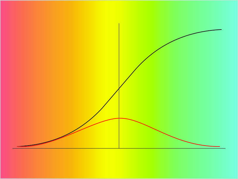
“I been reading your stuff, you had a graph in one post looks just like the graph in a different post. Here, I printed ’em out. What’s up with that?”
“But they plot entirely different things, brightness against distance in one, atom loss against time in the other, completely different equations.”
“Yeah, yeah, but the shapes are the same I don’t care you say they got different equations. Look, they even both go through the same points at x=2 and 4. What’re you trying to pull here?”

“Not pulling anything. Those two curves are similar, yes, but they’re not identical.” <quickly building charts on Old Reliable> “Here, I’ve laid them both on the same axis. For good measure I’ve extended the x‑axis into a second panel with a stretched‑out y‑axis. What do you see?”
“Well, the orange one goes up and stops but it looks like the blue one’s headed for the sky.”
“It is. But where on the x-axis do those things happen?”
“Zero and one. Okay so the blue line squoze in a little.”
“How about out there at the x=8 end? Looks like they’re close, I’ll grant you, but check the y‑values at at the left of the second panel.”
“Uhh… Looks like blue’s four times higher than orange. Then the orange line flattens out but the blue line not so much.”
“Mm‑hm. So they behave differently at that end, too.”
“Yeah, but what about in the middle here” <jabs finger at Old Reliable’s screen> “where they’re real close and even cross over each other a couple times and you could just draw a straight line?”
“You’ve put your finger on something that challenges every theoretician and research experimentalist who works in a quantitative field. How do you connect the dots? Sure, you can eyeball a straight line through observed points sometimes, there are even statistical techniques for locating the best possible straight line, but is a straight line even appropriate? Sometimes it is, sometimes it’s not, and often we don’t know.”
“How can you not know? Everything starts with a straight line, shortest distance between two points, right?”
“Only if they’re the right points. Real observations are always uncertain. Lenses are never perfect, adjustment screws have a little bit of play, detector pixels are larger than a perfect point would be, whatever. Good experimentalists put enormous amounts of time and care into eliminating or at least controlling for every imaginable error source, but perfect measurements just don’t happen.”
“So it’ll be a fuzzy straight line.”
“For some range of ‘fuzzy’, mm‑hm. Now we get into the theory issues. We’ve already seen the simplest one — range of validity. Your straight‑line approximation might be good enough for some purposes in the x‑range between 2 and 4, but things get out of hand outside of that range.”
“Okay, in graphs. But these two curves both look good. Why choose one over the other?”
“That’s where theory and data collude. Sometimes theories tell us what data to look for, sometimes the data challenges us to develop an explanatory theory, sometimes we just try curve after curve until we find one that works across the full range that experiment can reach but we don’t know why. What’s exciting is when we get to use the data to determine which of several competing theories is the correct one. Or least incorrect.”
“I got other ways to get excited.”
“Of course you do.”

~~ Rich Olcott


 “Good. Now copy A1:A7 by value into C1:C7 and generate a scatter plot of B1:C7. This time apply the logarithmic scale to the y-axis. This’ll show us how often we’d need to compound to get the yield on the x-axis.”